NAI (Support Center for Inclusion)
June of 2023
Porto, Portugal
Technical Rider
Tasks
User research
Information architecture
Tasks flow
User testing
Tools
Figma
Timeline
12 weeks
Links
Figma prototype
Documentation
Overview
This project involves creating a mobile application to improve communication and accessibility at the NAI (Inclusion Support Center) of the University of Porto. The goal is to address issues related to information dissemination, empathy and inclusion, language barriers, and lack of integration across different faculties within the university, enhancing interaction between the NAI and the academic community.
Project Goals
Create a mobile app that enhances communication and accessibility at the NAI, simplifies inclusion service requests, and standardizes processes across faculties, along with a consistent, accessible user experience.
Methodology
Design Thinking
Phase 1. Empathize
Keys
User research
Interviews
User Research
To understand the challenges faced by the university community and the NAI, interviews were conducted with key members of the NAI and the broader university community. The research uncovered several main challenges:
Community Insights
Empathy and Inclusion: Inclusion is still seen as a taboo in many areas, which impacts the attention to the needs of students with disabilities.
Language Barriers: International students struggle with communication, as most of the NAI's content is only available in Portuguese.
Information Dissemination: The NAI's presence is limited, with information being dispersed and the official website difficult to access.
Integration Across Faculties: Each faculty has a different NAI representative, but the lack of standardization across processes creates confusion.
Phase 2. Define
Keys
Personas
User Journey
Task Analysis
A Task-Outcome Canvas was developed to map out the tasks users must perform when interacting with the NAI via the app. Key tasks include:
1. Creating and managing requests (temporary or permanent).
2. Creating and managing requests (temporary or permanent).
3. Creating and managing requests (temporary or permanent).
4. Accessing educational content and event information.
5. Finding and saving relevant NAI contacts.
6. Tracking the progress of inclusion requests.
User Personas and Context
Two primary personas were defined to represent typical app users
Stephanny: Neurodivergent and needs continuous support to access inclusion service.
Leticia: Visually impaired, requires simplified navigation and accessible design.
Phase 3. Ideate
Keys
Interactivity
Customisation
Real-Time Feedback
Content Inventory
The app's design consists of several core components
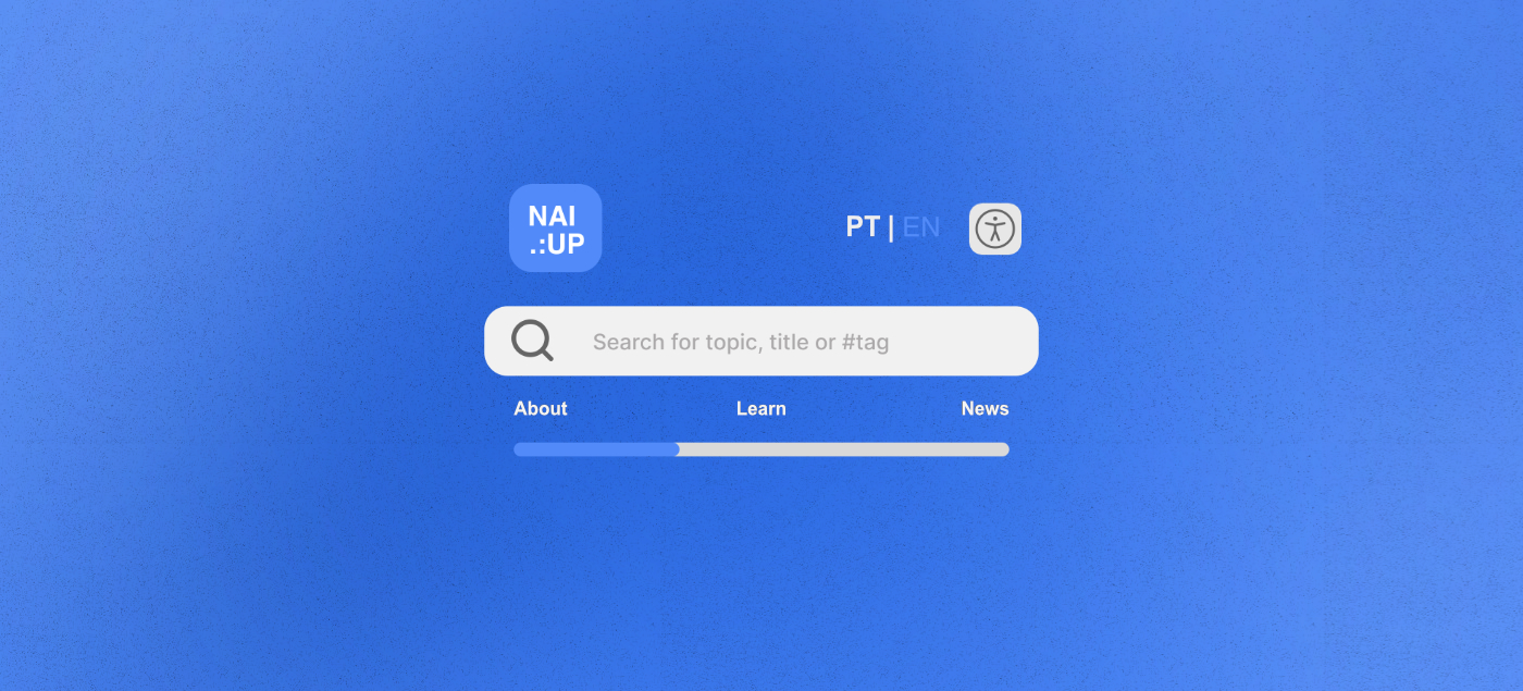
Top Menu
Enables users to change the language and access accessibility settings.
Bottom Menu
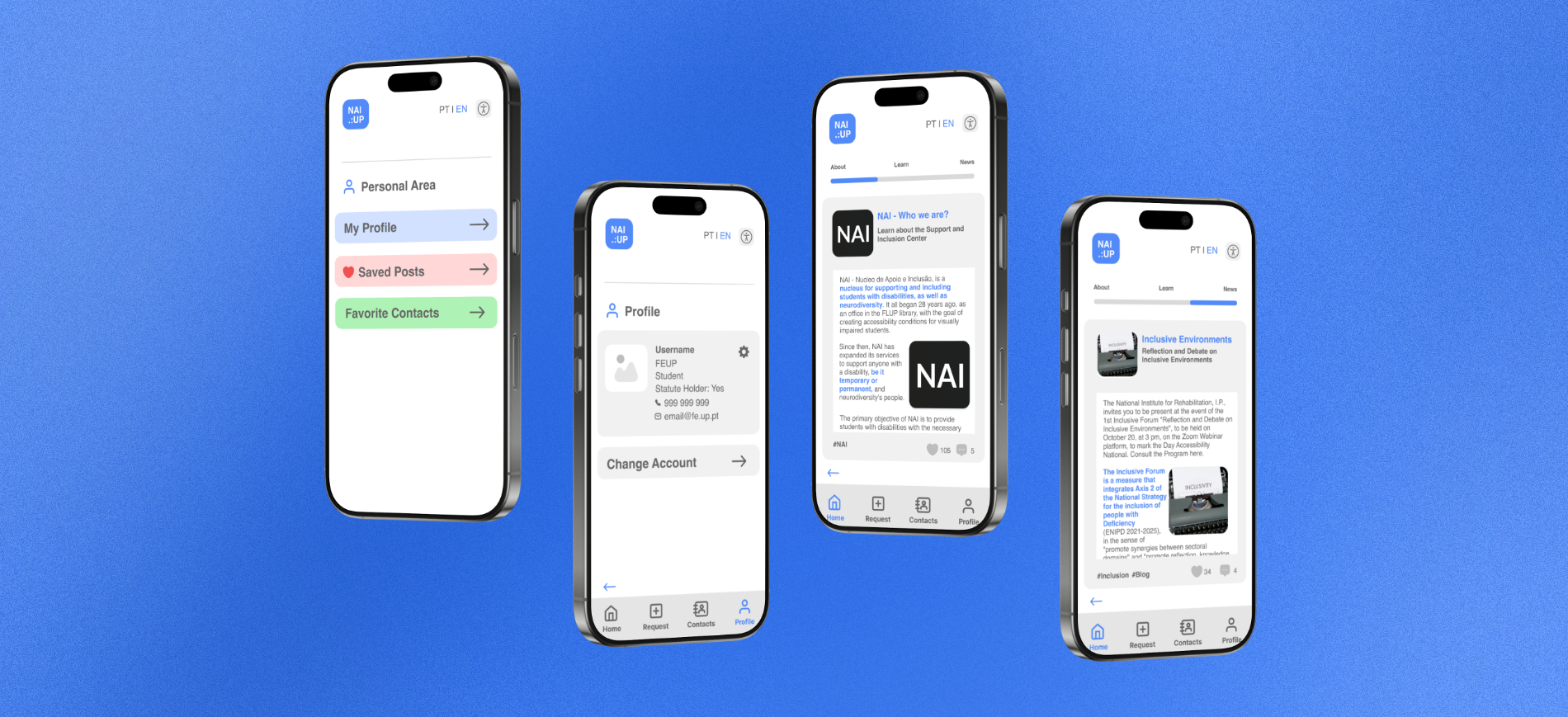
Provides quick access to Home, Requests, Contacts, and Personal Area
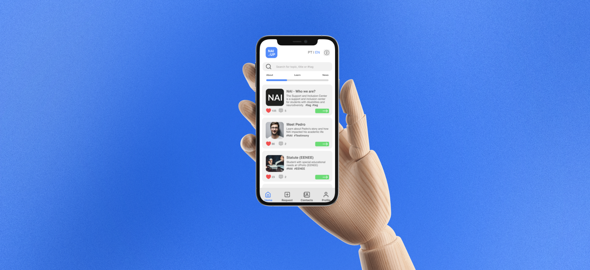
Home
Contains general information about the NAI, organized into a feed of posts categorized by type (general info, inclusion education, and news).
Requests
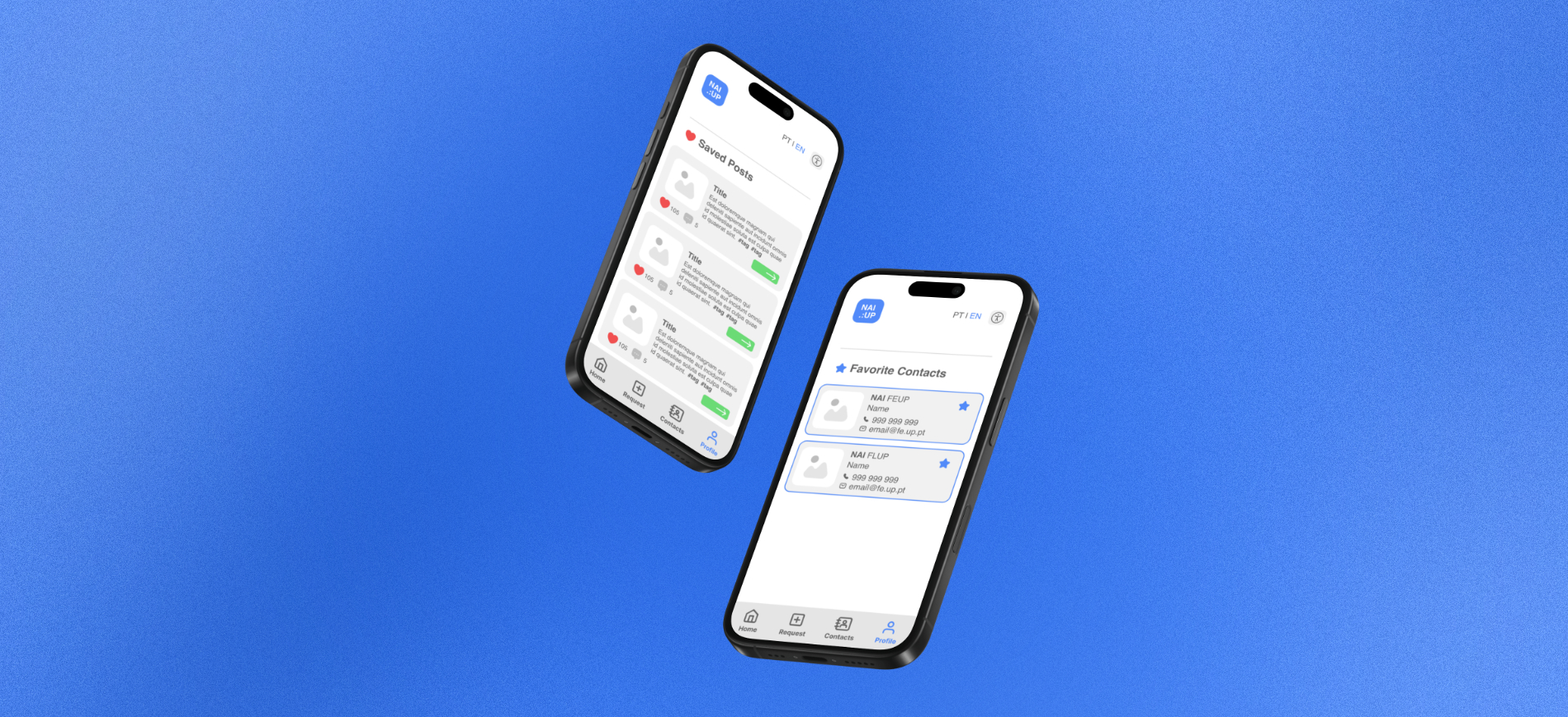
Users can create and track temporary or permanent requests and view related educational articles.
Contacts
Displays contact cards of NAI representatives across all university faculties.
Personal Area
Allows users to manage their profiles, saved posts, and favorite contacts.
Phase 4. Prototype
Keys
UI Design
Content architecture
Lo-Fi Prototyping
The initial stage of interface design began with a hand-drawn sketch, which acted as the first low-fidelity prototype of the app. Key components designed at this stage included
- A sliding submenu to organize content into different feeds.
- A feed-style post format.
- A bottom menu with icons for quick access to various areas.
Interaction Scenarios
The app features a fixed top menu, which includes essential functions such as search, language selection, and accessibility options.
The Home Menu allows users to navigate posts using either the search bar or by browsing categorized content feeds.
In the Requests Menu, users can create or track requests and access related information.
The Contacts Menu helps users find and save contacts from the NAI, categorized by central administration and faculty representatives.
In the Personal Area, users can access and manage their profiles, saved posts, and favorite contacts.
Phase 5. Test
Keys
UI Design
Content architecture
Usability Testing
Two rounds of testing were conducted to assess the interface's usability:
1. A pilot phase to gather initial feedback.
2. A more in-depth testing cycle with users to evaluate usability across different scenarios.
Main Functions Tested
- Language switch: Accessed via the top menu.
- Accessibility settings.
- Search functionality.
- Home Menu: Navigating content feeds, accessing and saving posts.
- Requests Menu: Creating and tracking requests.
- Contacts Menu: Finding and saving contacts.
Pilot Phase
The “Thinking Out Loud” method was used, where users verbalized their thoughts while interacting with the app. This helped identify usability issues that required further refinement.
Testing Cycle
Six users participated in the final round of testing. One of them, a visually impaired NAI representative, provided crucial feedback on screen reader navigation (VoiceOver).
Key findings from the tests include:
- Visually impaired users found the search function and list-based navigation essential.
- Other users encountered some initial confusion with certain submenus but adapted quickly after a short learning curve.
Phase 6. Refine
Keys
UI Design
Content architecture
Prototyping Mid-Fi and Hi-Fi
After the pilot phase, several key adjustments were implemented to enhance user experience. These changes included modifying the accessibility icon for greater clarity, refining submenu terminology for consistency, and restructuring the Personal Area to simplify navigation by removing the horizontal slider. Additional refinements based on usability tests included relocating the search bar to the top of the page for improved accessibility, clarifying the Requests menu by replacing the "+" icon with an explicitly labeled “Request” button, and unifying terminology by replacing “favorite” with “save” to avoid confusion.
Final Thoughts
Insights
This project explored the potential of a user-centered app to enhance communication between the NAI and the academic community. Through the Design Thinking approach, the project focused on making the app inclusive and accessible, especially for visually impaired users. Despite some initial challenges, the design was well-received, demonstrating the importance of adaptability, consistent language, and accessible navigation for all types of users.